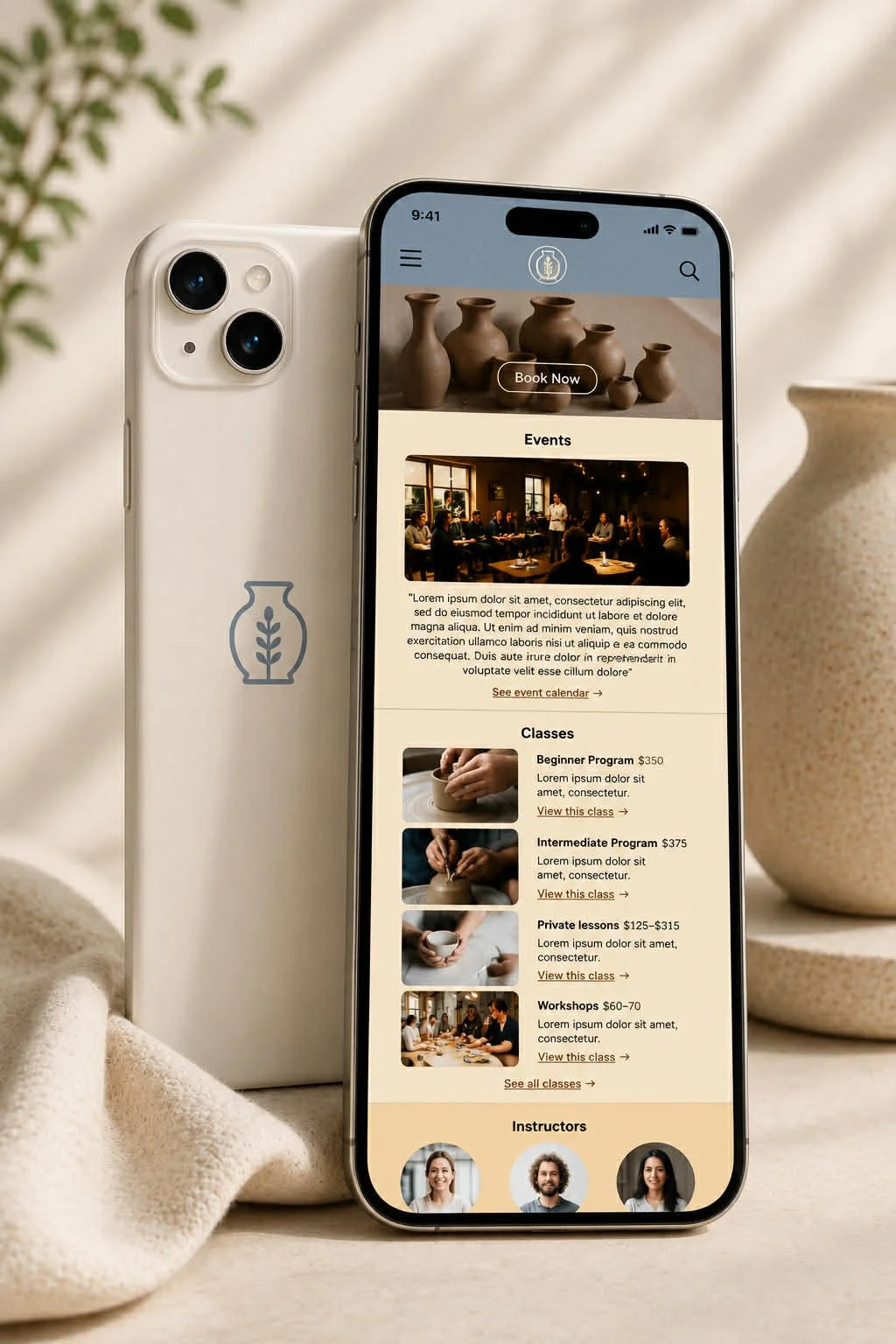
Welcome to TheCozyKiln! A responsive website for a fictional pottery studio.
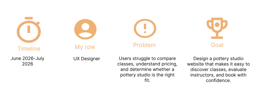
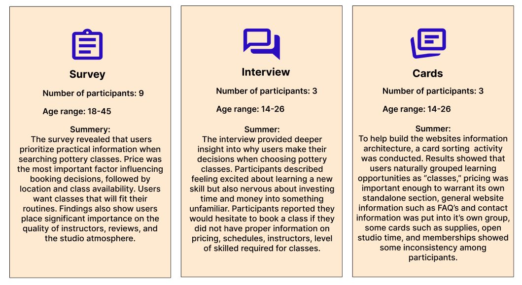
User Research
Affinity mapping
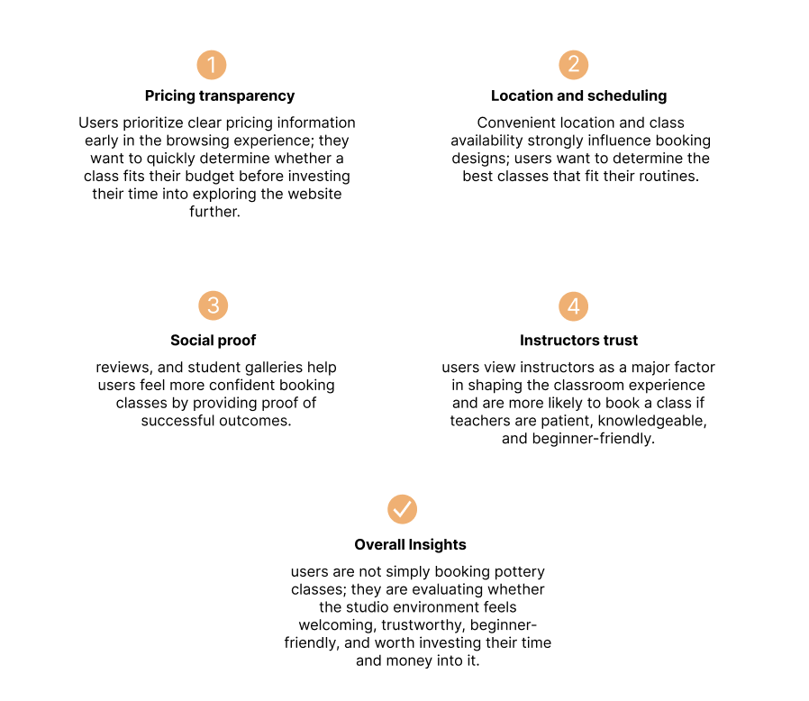
Insights
Empathy Map
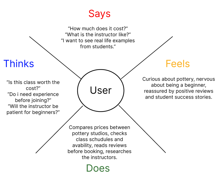
Problem Statement
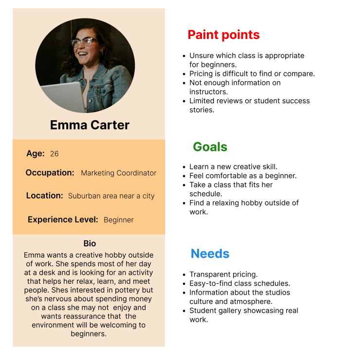
Emma needs a way to easily compare pottery classes, instructors, schedules, and pricing because she wants to feel confident in her decision before investing time and money in a new hobby.
User Persona
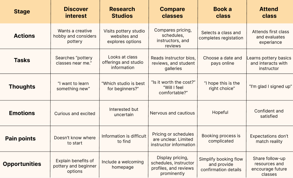
User Journey Map
Competitive Audit
Identify industry standards, usability patterns, and opportunities for improving class discovery, booking, and beginner accessibility within pottery studio websites.
The goal
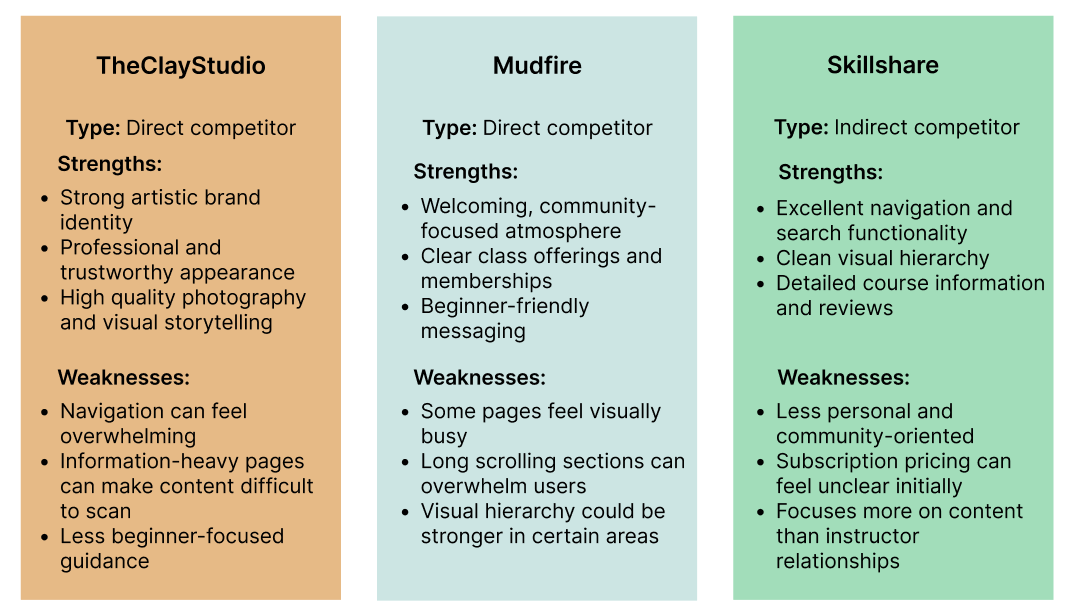
The competitors
TheClayStudio
Mudfire
Skillshare
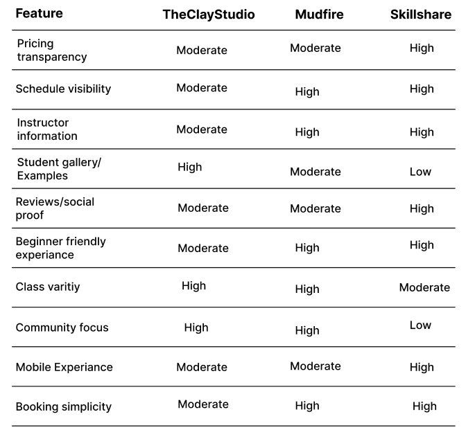
Users want pricing and schedules to be immediately visible before committing to a class.
Instructor profiles are critical because users want to know who they are learning from.
Student galleries help build confidence and demonstrate potential outcomes.
None of the competitors fully combines transparent pricing, instructor transparency, student success stories, and simple booking
Insights
Conclusion
The competitive audit revealed an opportunity to create a pottery website that prioritizes clear pricing, accessible schedules, detailed instructor profiles, and student success stories while maintaining a simple booking experience. By combining the online learning platforms, the website can better support users throughout their decision-making process.
Full audit
Ideation
How might we? questions
How might we help users quickly compare classes?
How might we make beginners feel welcome?
How might we simplify booking?
How might we showcase student success?
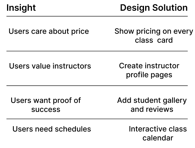
Insights and Solutions
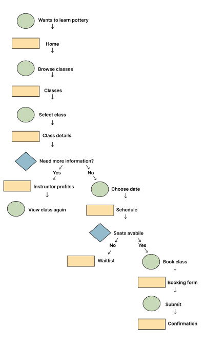
Main user flow
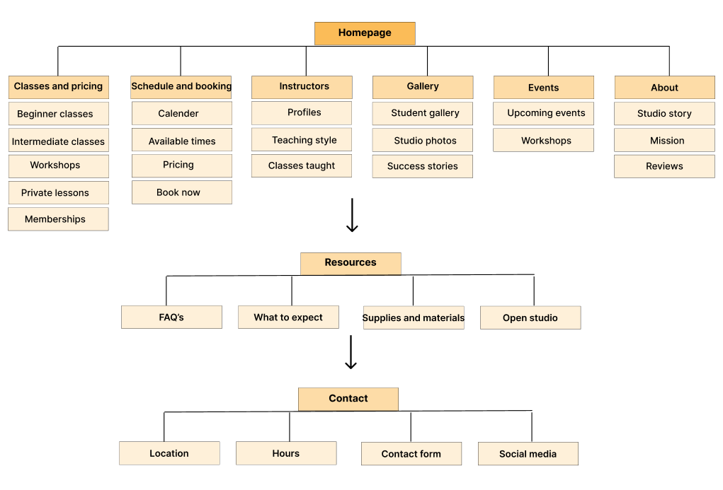
Sitemap
Wireframes
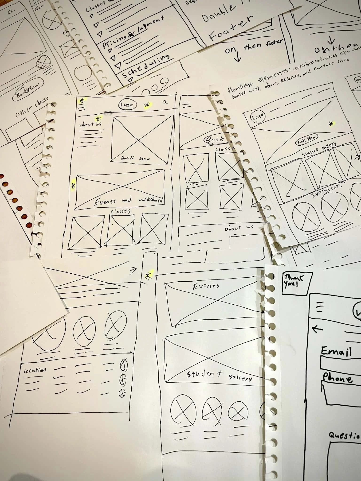
Paper wireframes
I created various paper wireframes for both desktop and mobile applications. I starred the best features of the wireframes to create the most accessible screens
Paper wireframes
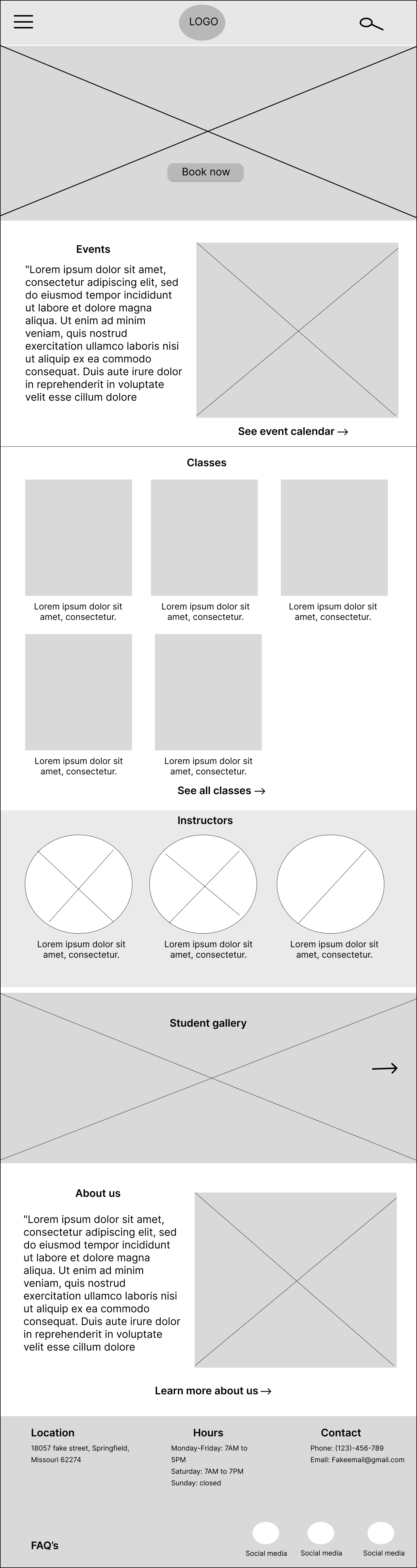
Digital wireframes
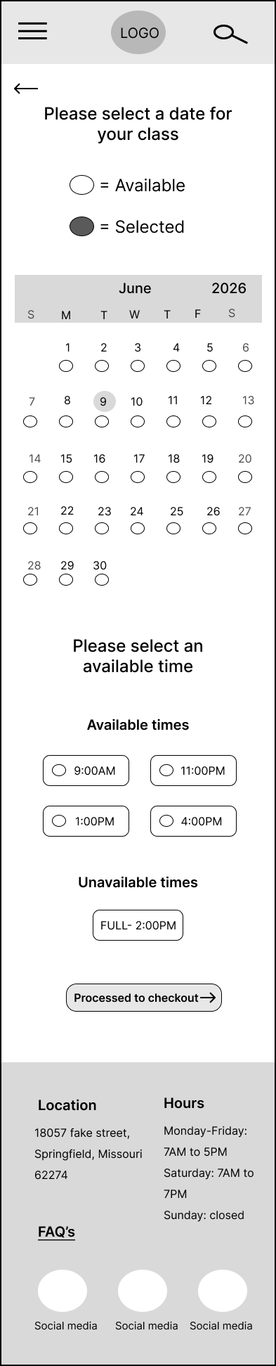

These are a few of the many digital wireframes I created. The first is the home screen for the desktop, and the other two are the mobile versions of the booking and checkout screens. I kept accessibility in mind, using hierarchy to keep the most important information at the top or the boldest. I kept a hamburger menu and search bar in the header for easy navigation, as well as the “FAQ,” location, and hours in the footer.
Lo-fi Prototype
I conducted a moderated usability study on both prototypes. I had three participants follow an array of tasks and gathered insights based on their ease of completing tasks.
Insights showed:
Navigation labels were intuitive, it allowed users to quickly browse class offerings.
Instructor profiles increased confidence and helped users feel more comfortable.
Users need clear indicators of skill level.
Mockups

Mobile

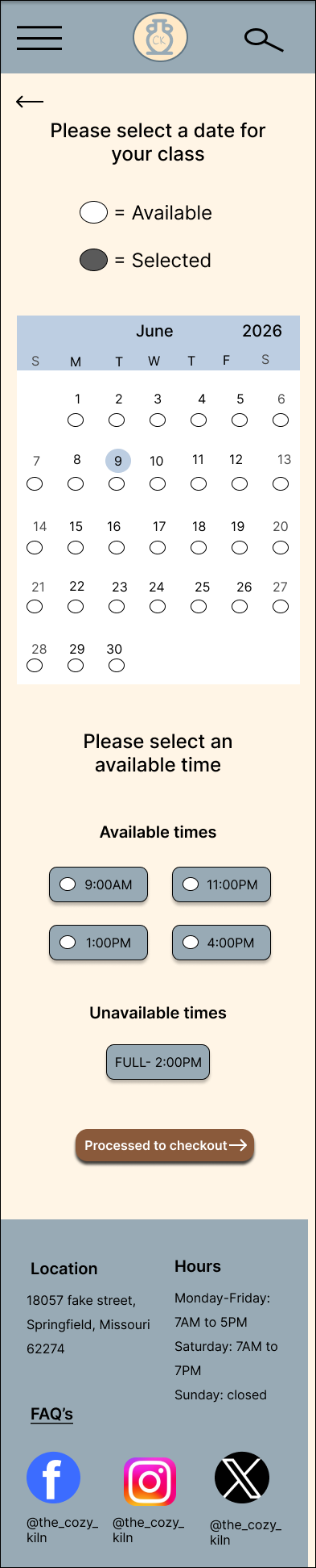

Desktop
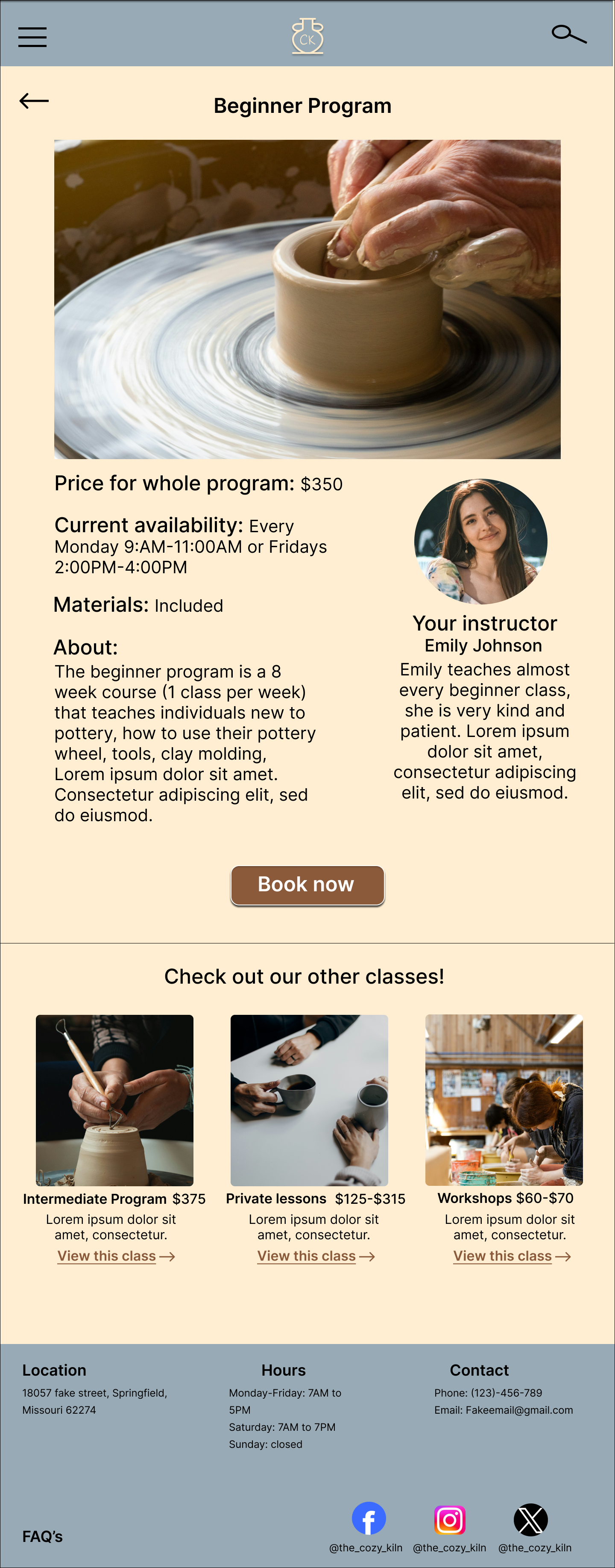
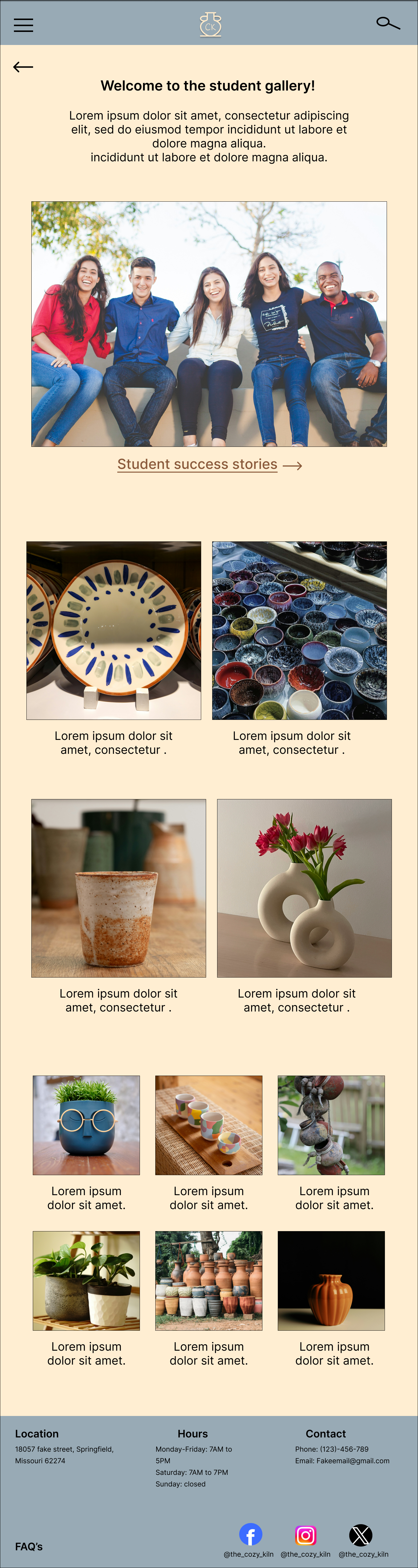
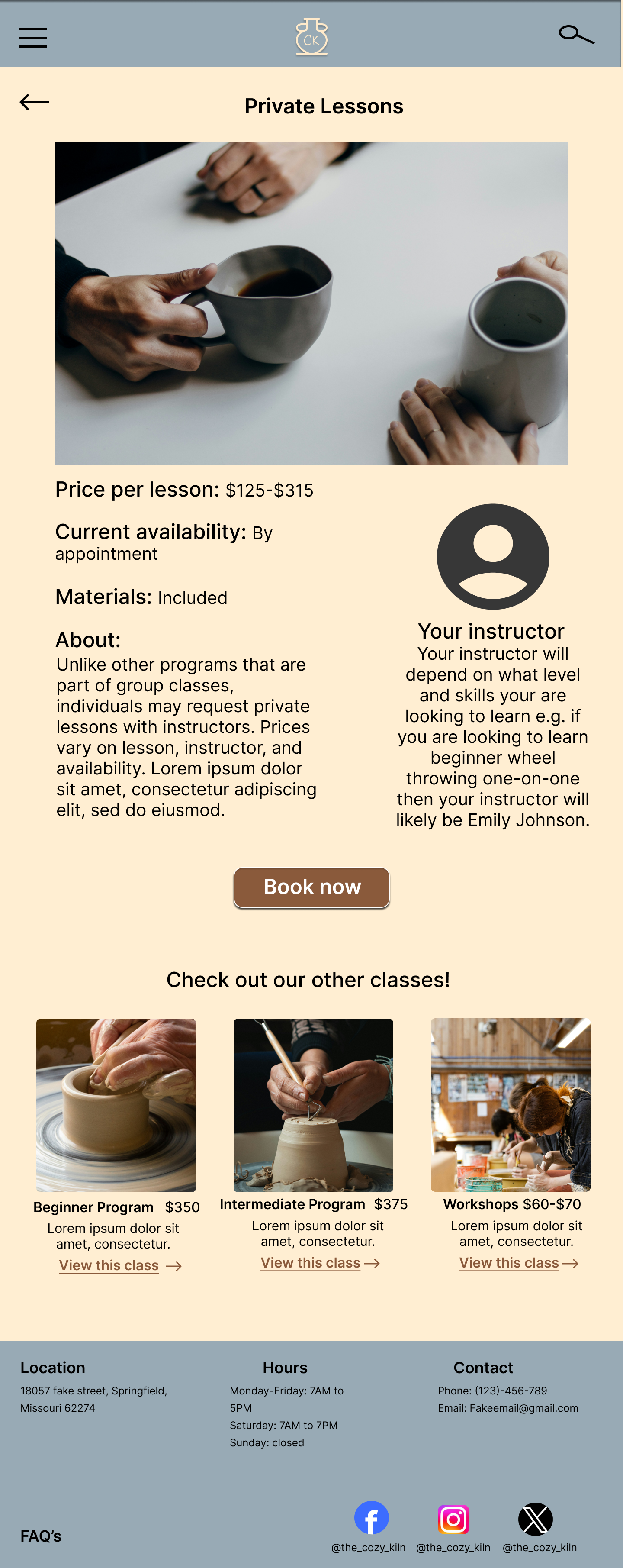
Before usability study

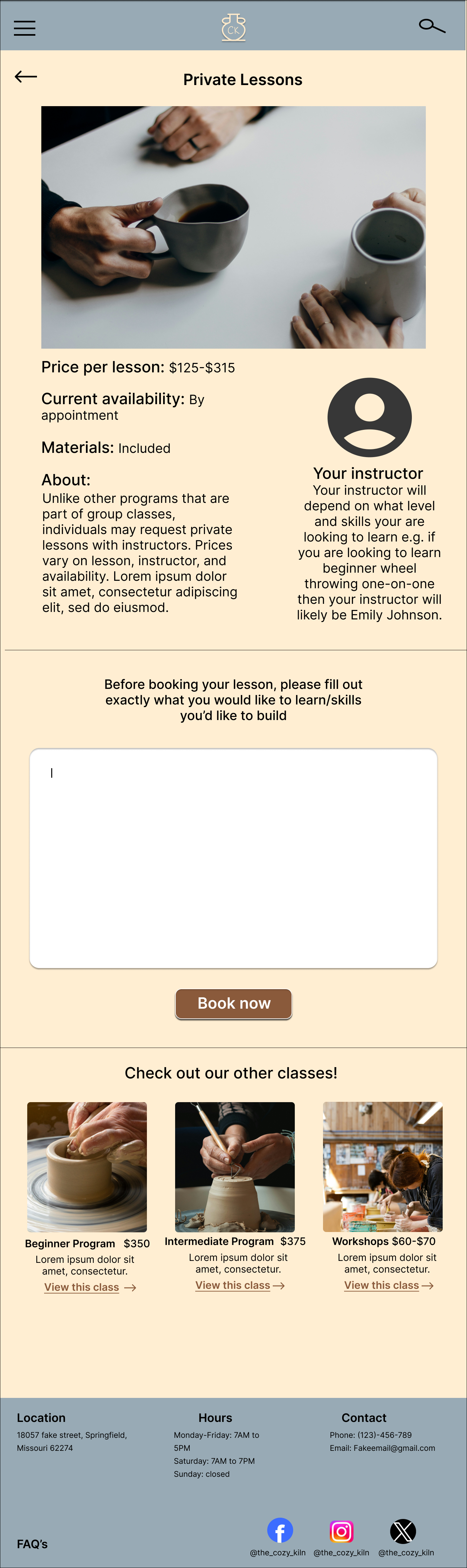
After usability study
After the usability study, I concluded that users want as much customization as possible. To accomplish this, I added a section to the private lesson page so that users can explain exactly what they want to learn and what they’re looking for.
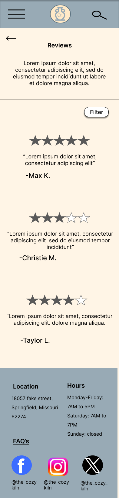
Before usability study
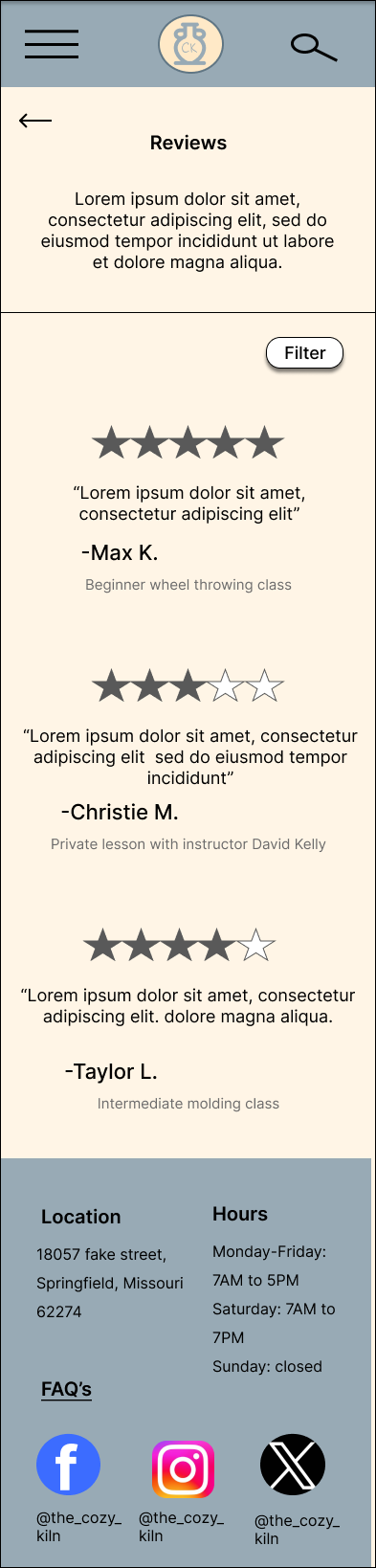
After usability study
It was made clear that users like having plenty of information before booking a class; to help with this, on the review page, I added what class each reviewer took.
High-FI Prototype
I conducted a moderated usability study with three participants. Each participant was asked to complete a set of prompt tasks while going through the hi-fi prototype and was then asked questions about that task (e.g., how easy was it to complete?). Technical issues were discovered and quickly fixed.
Insights show:
Users quickly identified the primary call-to-action.
Transparent pricing increased confidence.
Users appreciate customization.
The booking flow felt straightforward.
Research
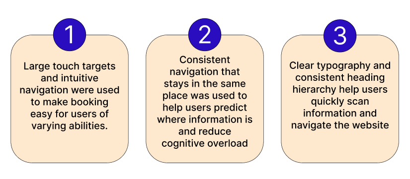
Accessibility considerations
Final Thoughts
Every design decision -from simplifying navigation to highlighting instructor profiles and student galleries-was informed by user research.
Through designing TheCozyKiln, I learned that successful service websites are built on trust as much as functionality- through research it shows users want to know exactly what to expect before booking a class.
If I were to continue developing this project, I would expand the screen size variations for more devices as well as adding waitlist notifications and user account for managing upcoming classes.
(417)-706-8562