Sitemap
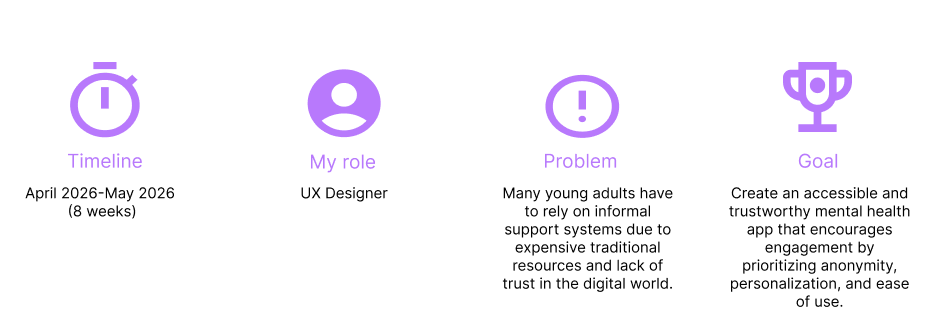
Welcome to Haven! This is an app to provide accessible mental health resources for young adults who cannot afford therapy.
Research
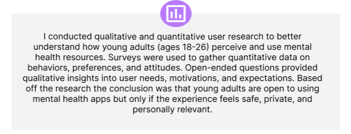
Understand how young adults cope with mental health without therapy.
Identify what makes users feel comfortable and safe using a mental health app.
Identify the desired features and support what users actually want from the app.
The research Goals:
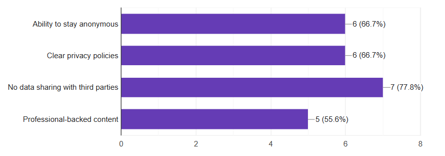
Notable findings:
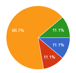
66.7% of users are hesitant to share their thoughts and emotions with a mental health app.
The majority of users want privacy and the ability to stay anonymous.
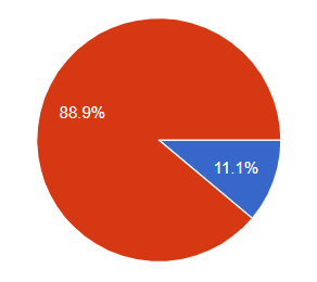
88.9% of users have never used a mental health app.
Summary
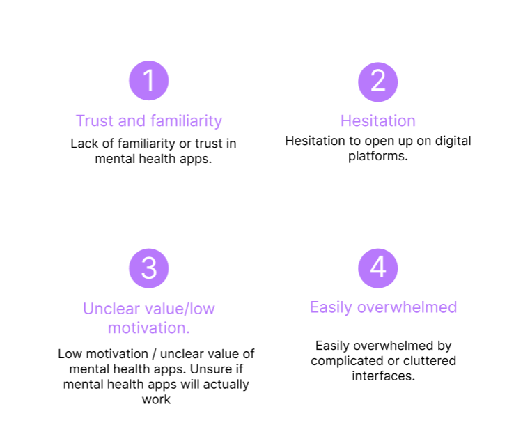
Paint points
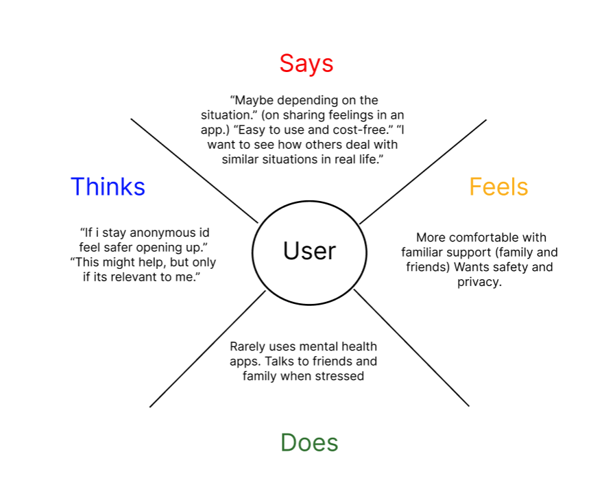
Empathy map
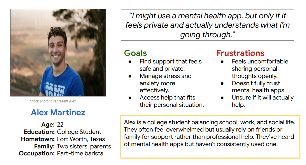
User persona
Problem statement
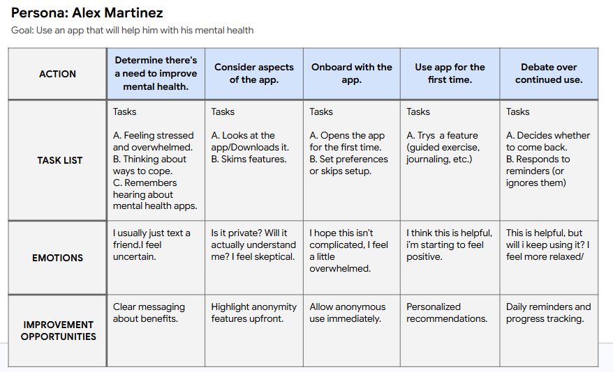
User journey map
Competative Audit
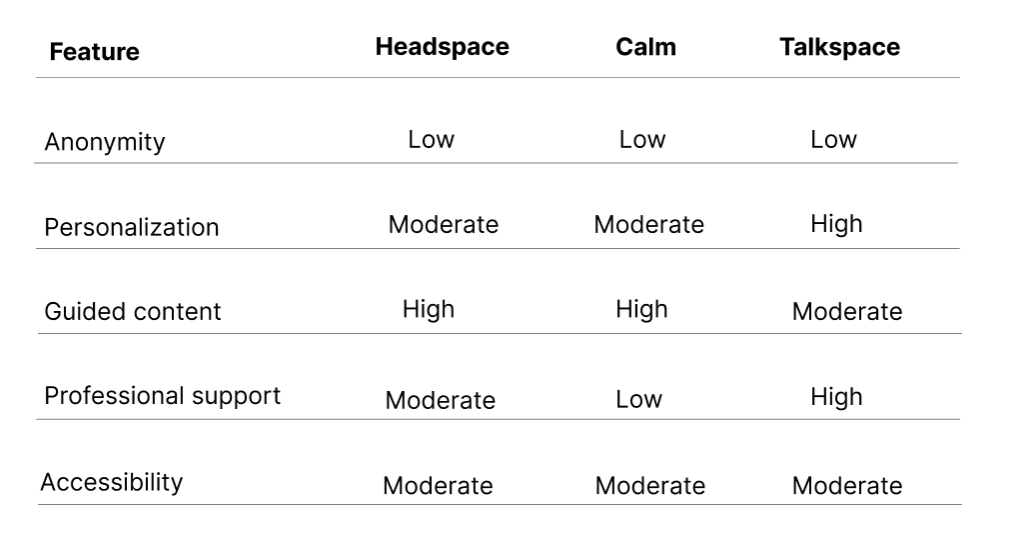
Evaluate existing mental health apps to understand how they address trust, anonymity, personalization, and ease of use, and identify opportunities for improvement.
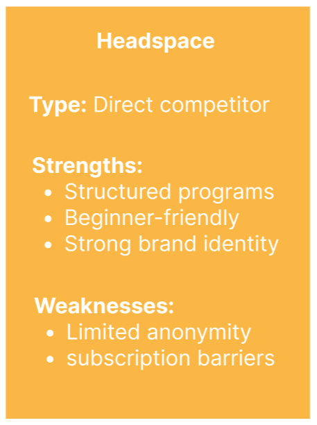
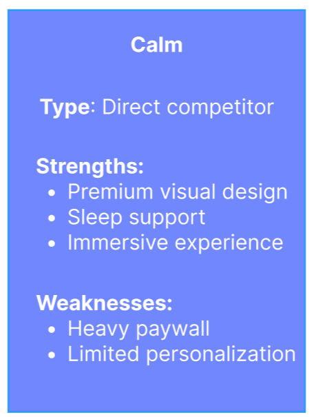
Competitors
Headspace
Calm
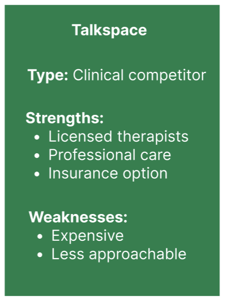
Talkspace
Objective
Insights
Users value anonymity, but competitors rarely prioritize it.
Subscription models create barriers for hesitant users.
Most apps offer broad solutions rather than tailored support.
Current competitors excel in mindfulness, therapy, or wellness content; there is a clear opportunity to create more approachable mental health solution centered around privacy, personalization, and user trust.
Conclusion
Full audit
Ideation
How might we design a mental health app that feels safe, anonymous, and personalized enough for users like Alex to consistently engage with?
“How might we?” statement
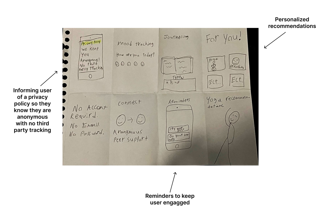
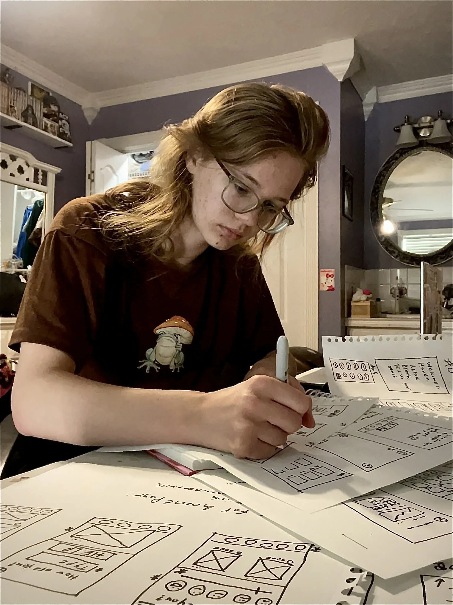
Crazy 8s/Rapid sketching

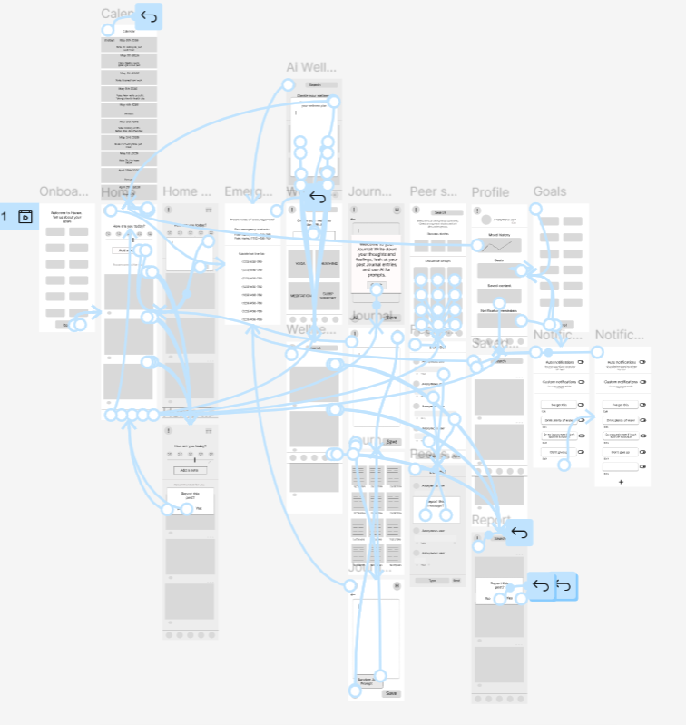
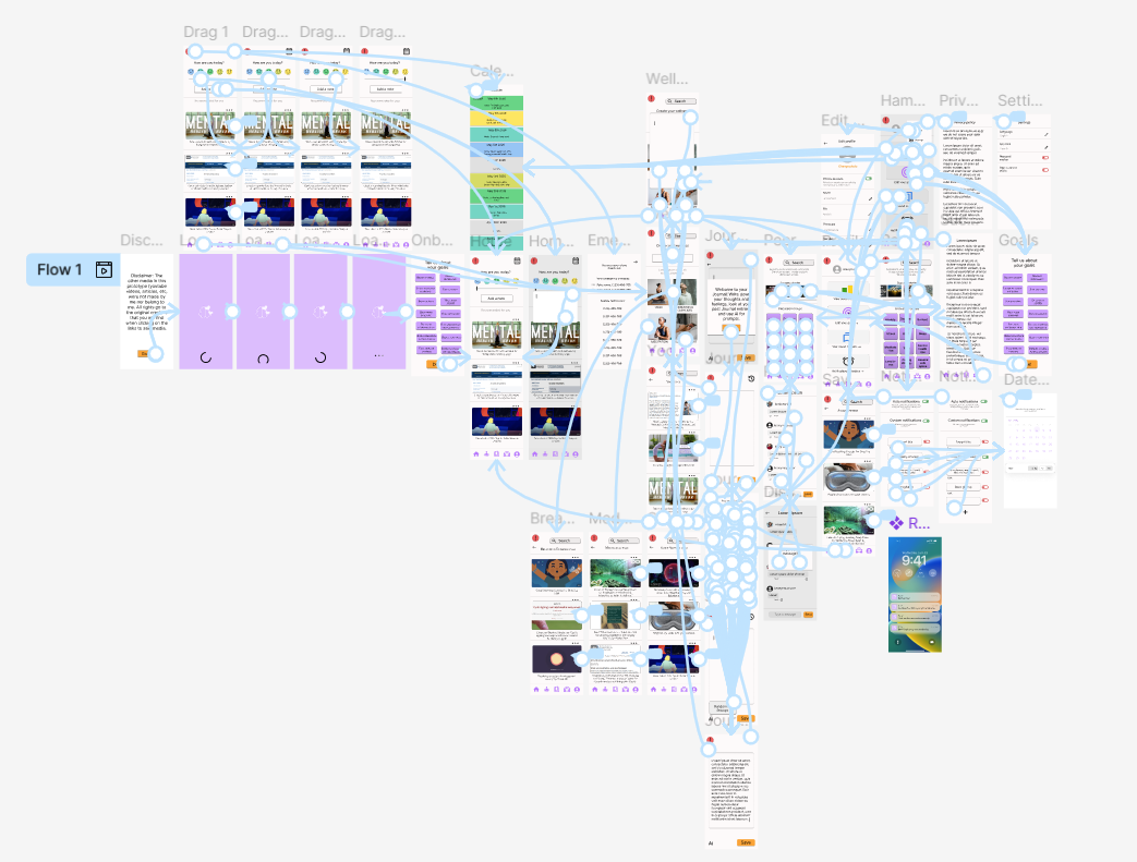
Sitemap
Wireframes
Before usability study

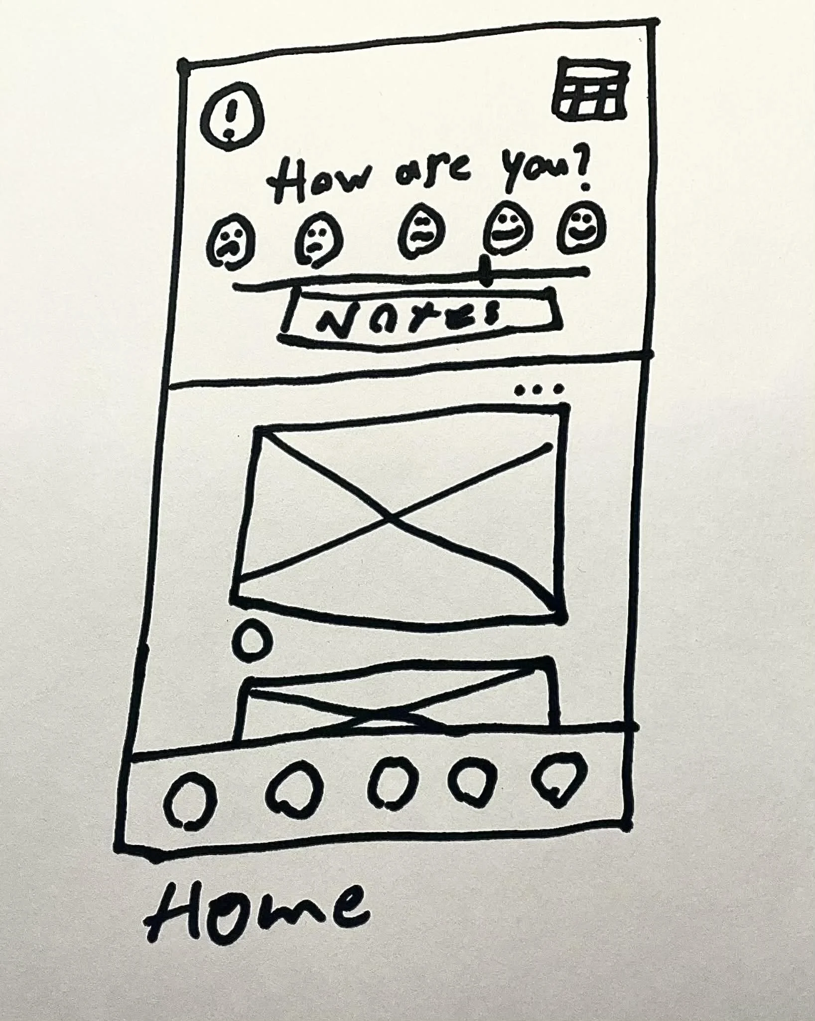
Paper wireframes
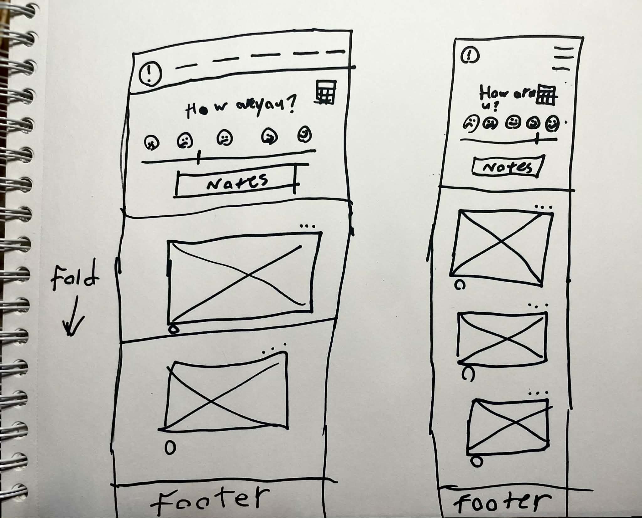
Desktop and mobile website versions

Digital wireframes
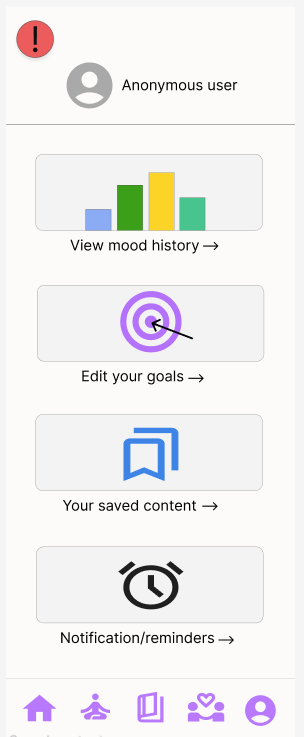
Final home page

Lo-fi prototype
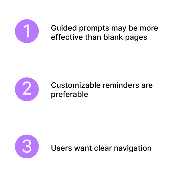
Insights

Mockups


Before usability study

After usability study
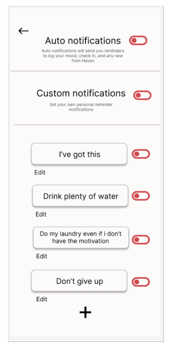
Users appreciate the ability to stay anonymous and want more in-depth account settings. For this, for this, I added four more frames with settings and displayed a privacy policy for emphasis on the anonymity.

After usability study
Users wanted the ability to choose specific times and dates for their reminders for personalization. I added a screen to give them this ability, and I added a component to have toggles start on.
Hi-fi prototype
Research summery
Total of 4 participants, 3 in a moderated in-person study and 1 in an unmoderated remote study.
Users were given 5 tasks to complete within the hi-fi prototype, and then were asked to fill out a questionnaire.
User’s answers, actions, click paths, and quotes were noted and made into insights

Insights
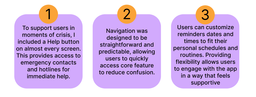
Accessibility considerations
What I learned and would do differently

(417)-706-8562